Design System
The tokens, type, icons and components this site is built from. Rendered live from the same stylesheet the site uses. If it looks right here, it is right in production.
Logo
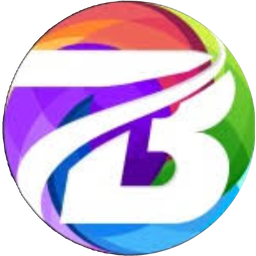
BvLogic = Birdview Logic. The mark is a colourful orb carrying a white B. It is used as artwork, never redrawn, recoloured or reconstructed.

Mark
Sizes 64 / 128 / 256 px. Header uses 64 at 32 px for crispness on 2× displays.
 BvLogic
Lockup
Mark + wordmark, 9 px gap. "Logic" is upright and violet, not italic.
Wordmark spec
- font
- Plus Jakarta Sans
- weight
- 700
- size
- 21px
- tracking
- -0.03em
- accent
- #7c3aed (light) · #b794f6 (dark)
The lockup on dark
BvLogic
On light: ink wordmark, accent #7c3aed.
BvLogic
On dark: white wordmark, accent #b794f6.
The mark itself is unchanged. It carries its own colour and reads on both.
Rules
Do
- Use the supplied artwork at 32 px or larger
- Keep clear space of at least the mark's height on every side
- Swap only the wordmark colour between light and dark
- Use
mark-64.pngfor UI,mark-256.pngfor print or social
Don't
- Never redraw or reconstruct the mark. A simplified "B" is not the logo
- Never italicise "Logic", it is upright
- Never recolour, outline, rotate or add effects to the orb
- Never place the mark on a busy photograph without a solid backing
- Never render the wordmark in a font other than Plus Jakarta Sans 700
Two earlier marks were rejected and must never appear: an
abstract node-cluster mark, and a plain swirl that read as a
"D". Files for both still exist in the v1 asset folder (logo.svg,
logo-dark.svg, mark.svg) and are excluded from the build. If you are
picking assets by filename, take them from src/assets/img/mark-*.png only.
Files
| File | Size | Use |
|---|---|---|
| mark-64.png | 64 px | Header, UI at 32 px on 2× displays |
| mark-128.png | 128 px | Cards, medium placements |
| mark-256.png | 256 px | Print, social, structured data |
| apple-touch-icon.png | 180 px | iOS home screen |
| favicon.ico | 16/32/48 | Browser tab, older browsers |
| og-image.png | 1200×630 | Link previews |


Colour
Brand violet, a cool neutral ramp tuned for long-form reading, and four semantic pairs. Every foreground/background combination in use meets WCAG AA.
Brand
Neutral
Semantic
Information the reader needs but that changes nothing.
A recommendation worth following.
Something that will cost you if ignored.
Data loss, outage, or a decision that is hard to reverse.
Typography
Plus Jakarta Sans for display, Inter for body: self-hosted, latin subset, no third-party request. Scale is a 1.200 minor third on a 16 px base. Body line-height is 1.7 and measure is capped at ~72 characters, because most of this site is long-form reading.
| Token | Size | Used for | Sample |
|---|---|---|---|
--t-4xl | 3rem / 48px | Hero | Ag |
--t-3xl | 2.25rem / 36px | h1 | Ag |
--t-2xl | 1.875rem / 30px | h2 | Ag |
--t-xl | 1.5rem / 24px | h3 | Ag |
--t-lg | 1.25rem / 20px | h4 | Ag |
--t-md | 1.125rem / 18px | Lede | Ag |
--t-base | 1rem / 16px | Body | Ag |
--t-sm | 0.875rem / 14px | Secondary | Ag |
--t-xs | 0.75rem / 12px | Meta | Ag |
Icons
One SVG sprite, referenced with <use>. 24×24 grid, 2 px
stroke, round caps, currentColor so they inherit text colour and are correct in
both themes automatically. Never unicode glyphs, because those render differently on
every platform and cannot be weight-matched to the type.
Components
Buttons
Badges
The last two matter: a section that is not finished says so rather than pretending to be live.
Card
Form controls
Hint text sits below the control.
Theme & dark mode
Both themes are authored separately, not generated by inverting the light palette. Inverted palettes produce muddy greys and blown-out accents. Dark mode is triggered by the OS setting and overridable by the toggle in the header; the explicit choice always wins, in both directions, and persists locally.
Resolution order
data-themeon the root element, the visitor's explicit choiceprefers-color-scheme, the operating system- Light
Applied tokens
- --bg
- page background
- --fg
- primary text
- --fg-muted
- secondary text
- --border
- separators
- --accent
- links and primary action
Use the control in the header to switch. This page re-renders in the other theme with no reload.
Accessibility rules
- Visible focus ring on every interactive element (never
outline:nonewithout a replacement) - Exactly one
<h1>per page, enforced by the build verifier - Every image carries an
altattribute, also enforced by the verifier - Icons are
aria-hidden; the accessible name lives on the control prefers-reduced-motiondisables the brand bar animation and smooth scrolling- Wide content (tables, code) scrolls inside its own container, so the page never scrolls sideways